
Color management is so easy to control these days it is surprising that everybody is not utilizing monitor calibration and using a color checker.
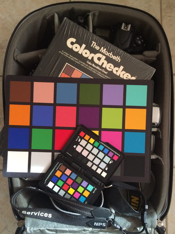
Xrite ColorChecker Passport
Before digging into exposure and cold practices from my past, notice anything odd about the above photo. A Macbeth ColorChecker? That is an original 9 x 13 color calibration chart. Macbeth is no longer around, they are now part of X-rite. I have been utilizing a managed workflow a lot longer than computers have been around.

Exposure Box from 1981
This is the very first image that I took at the start of my photography program. Yes the date says 1981. All assignments started with an image of the exposure box. This was a box in the far corner of one of the studios that had controlled daylight balanced illumination that had a grey card and a gray scale. This was to make sure that the camera light meter was calibrated and would show if you processed your film correctly. The school that I attended was geared towards turning out working photographers. Consistency in results is a sign of quality work.

This is how we standardized the exposure of Black and White proof sheets. All proof sheets included a Kodak T14 exposure scale. When step 7 was neutral gray the proof sheet was properly exposed and it would show if the film was properly exposed and developed.

Florescent Lighting Test
This image shows the process for the beginning of color management. This project was to show how to filter for florescent lights. There are many different bulbs that emit light at different color temperatures. This is all done automatically with todays digital cameras. It is only a problem these days when you have mixed lighting. Daylight and tungsten in the same scene is very common problem. Yes the slide is faded, but you get the idea.
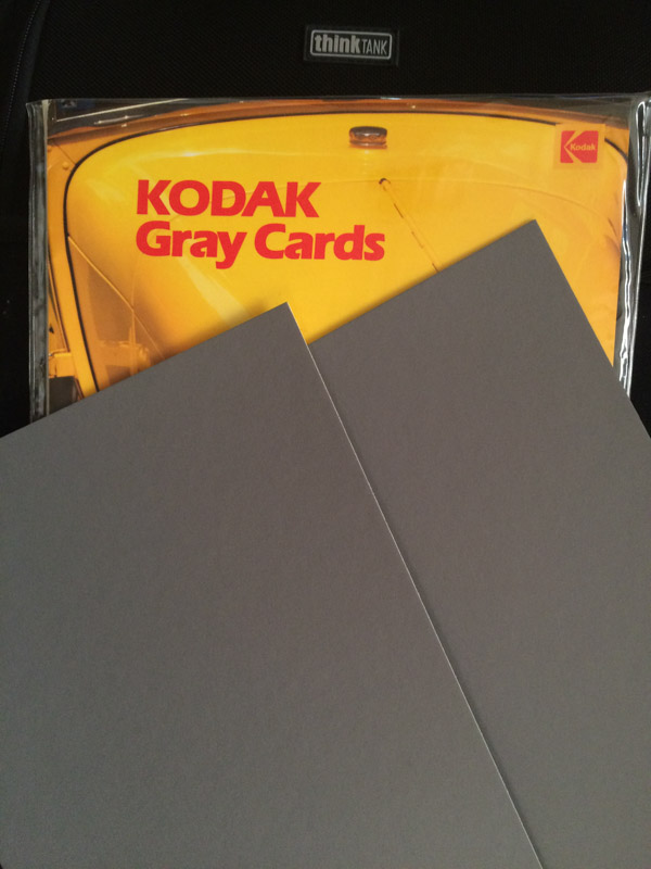
Kodak Gray Card
Kodak grey cards had multiple purposes. Before matrix and multi-zone metering the use of grey cards was wide spread in professional photography. It was the surest way to get a correct exposure in difficult lighting situations. Another trick was to include a grey card in a photo to assist printing. Many of times I would have a grey card in the corner of a product shot on large format film. The card would be cropped out during printing.

Colormunki Display
I now have all of my screens calibrated with X-rite products. The are easy to use and are reliable. I remember back in the 90's using a control panel on my Mac to visually color balance my monitor. Technology marches on. One of the great features of the Colormunki is that it has an ambient light sensor that monitors lighting conditions and adjust your monitor accordingly. I carry a ColorChecker passport with me on all shoots so that when I get back I can profile my camera for best results. One of the best examples I have ever seen to justify the use of a monitor calibrator was when I was shooting official portraits for soldiers. On the uniforms soldiers wear awards that are various colors. When comparing a calibrated monitor verse an uncalibrated monitor the color of the awards would change. The red awards appeared pink. A calibrated monitor doesn't just remove a color cast, it renders individual colors properly.
Add a calibrator to your workflow. It is not a calibrate once and never use it again. Monitors change as they age. Rental laptops need adjusting. Make your work look better on the web. The more you learn about exposure and color the better photographer you will become.