My Photography Workstation

Here's my Photography Workstation

Photography Workstation

Photography Workstation

The most common question I get after what camera do you use is what is your computer setup. I have been a Mac user since 1986. At first I used a company owned Mac but it was used for graphics and page layout. I have personally owned Apples since 1999. When I went to work as a government contractor we used IBM clones for about a year and then switched to the Power Macintosh 8500. That was a long time ago. The government upgraded us. To various Mac’s over the years until the government IT department switched to PC’s about a year before I left. The Mac has been my choice for my personal computer all of these years. 

Currently my workstation is a 27 inch iMac. Lots of RAM and a terabyte hard drive, nothing fancy. After using whatever was on sale for my external drives I have standardized on G-Technology hard drives. I am pleased with their performance and reliability. I use them for backup and storage. I have a 8tb thunderbolt raid drive as my main working drive and two drives for redundant storage. A 4tb USB drive handles the Time Machine duties. 

I am on my 3rd Wacom tablet. The medium tablet is just right for my use. I am more comfortable with a tablet than a mouse. I use the pen even when I don't need pressure sensitivity. 

Since you can't be a photographer these days without also shooting video I have a nice set of audio monitors. They are Mackie HR-824 mkII speakers. I just love the sound from these speakers. The are so flat and clean sounding. The only other brand that I considered were Genelec speakers but they are quite a bit more expensive and I had used Mackies on a recording session and just fell in love with them. They are really sweet. 

Everyone has there little dorky product that they can't live without and mine is a product called a Page-Up. It is a small plastic piece that has a narrow slit in it for holding sheets of paper upright on your desk. They are great for referring to shot lists or editing notes while working. They are about $10 at Amazon. 

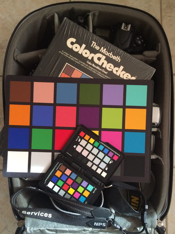
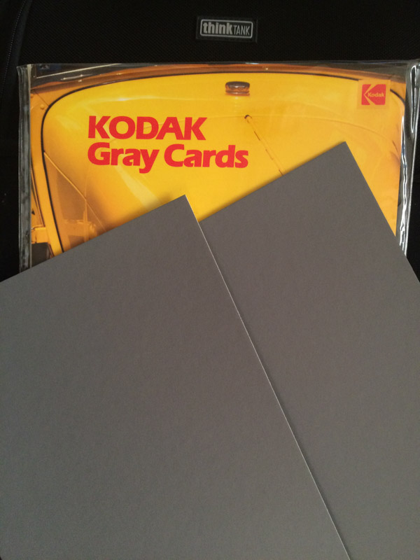
I am a big fan of X-Rite color calibrators and ColorChecker passport. I use mine all of the time and they are so easy to use. Get one now, the will make your work so much better. 

As far as software goes I use what pretty much what everyone else uses. I use Capture One Pro for image capture. Lightroom CC for organization and simple editing and Photoshop CC for serious edits. For video editing I use Final Cut Pro and DaVinci Resolve for editing. Of course Protools for audio editing. 

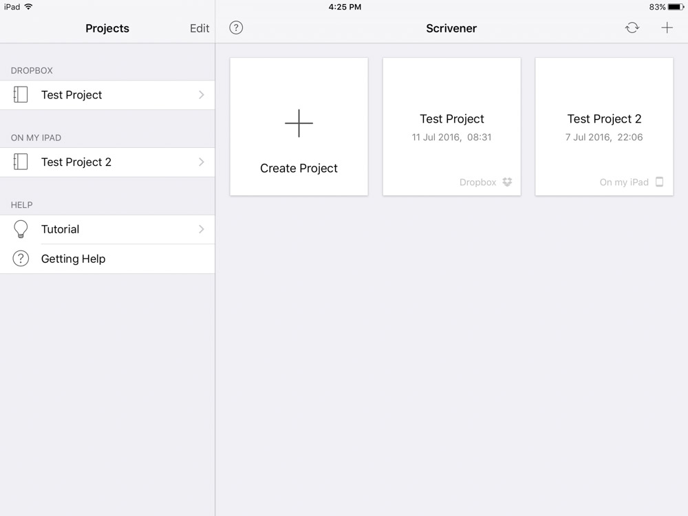
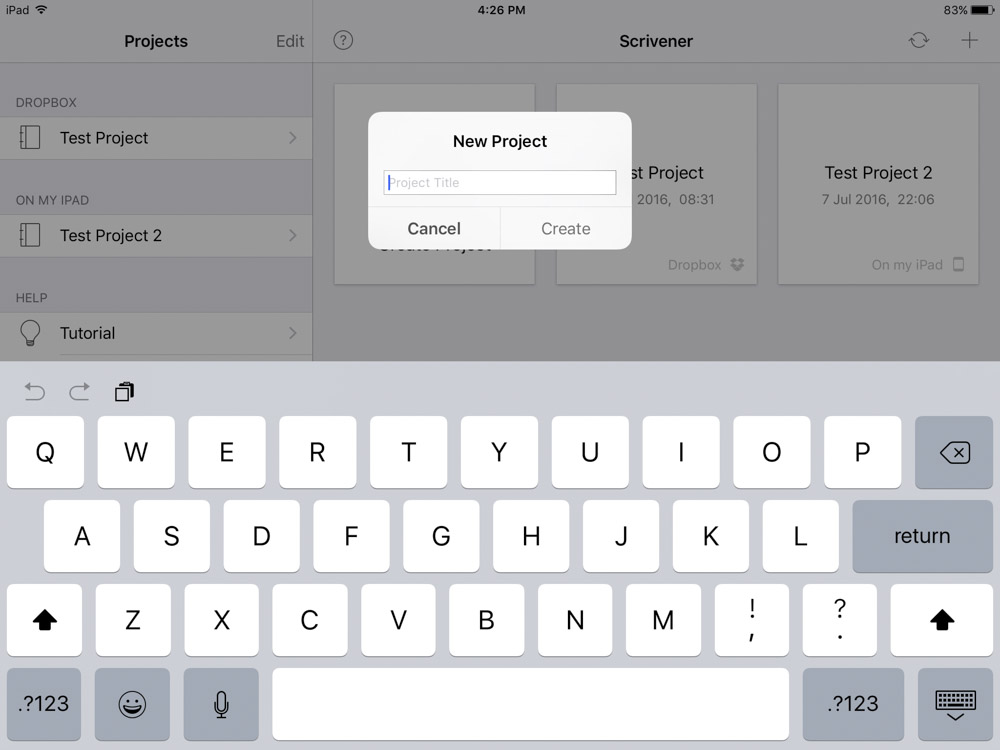
For all of my writing needs I use Scrivener by Literature and Latte. It is just a perfect program. I use it both on my Mac and iPad and sync with Dropbox. I would like to be a writer just so I could use this program all day it is that nice. 


Final Word. 

Now just a comment on workstation placement. I see so many photos on the internet of people working with their monitor in front of a window. Please move your monitor now. Having that light coming from behind your monitor is terrible for color correction. Just a friendly piece of advice. 

Fujifilm Instax SP-2 Review

I recently picked up a Fujifilm Instax printer and I must admit it is a lot of fun. The photo below gives a sense of the size of the printer. It is advertised as a printer for smartphones but will accept jpg's from camera's that are wi-if enabled. 


Fujifilm mini 8, Fujifilm Instax SP-2, Fujifilm Instax film

Fujifilm mini 8, Fujifilm Instax SP-2, Fujifilm Instax film

The Fujifilm Instax is an instant film process that bucks the "digital has taken over storyline". Digital images are so perfect and clean looking that when comparing an Instax print to an image on an iPhone the nostalgia factor tanks over and the print is kind of view as artwork. I have shot so many Polaroid image in my life that I really didn't appreciate how instant can be such a compelling and unique art form. Now that it is such a big deal to shoot in an analogue fashion the wonder of it all has returned. I especially recommend an Instax printer to anyone that has been raised only on digital photography because you get such a different feeling when viewing instant images. 


Fujifilm Instax SP-2

Fujifilm Instax SP-2

The printer is small and lightweight so that it can be carried in your camera bag while out taking photos. There are two trains of thought on using this printer. On one side it is convient to sit down at home after a shooting session and print your favorites. The alternate argument is take the printer with you when shooting and stop and print images as you go. I prefer the latter. I seem to feel more in the moment if i stop and contemplate my photos while shooting. The prints are great give gifts to give to the subject while shooting. On our trip to London in the 90's we took along a Polaroid Spectra and shot images as we traveled each day and when returning back to the room in the evening we displayed the prints around the room. That made the trip even more enjoyable and repeated this on each trip until Polaroid stopped making film. I am looking forward to having prints around our room on trips again. 


Instax SP-2 on/off and reprint buttons

Instax SP-2 on/off and reprint buttons

The printer creates a wifi network that uses Bluetooth to connect to the printer. Setup is drop dead simple. Remember to update the firmware when you first get the printer. This achieved with the Fujifilm Instax Share app available at the iTunes app store. This app is also how you send images to the printer. It acess's images through the Camera Roll so you can work on the images in you favorite iOS editor before printing. The images are low resolution but look great.


Instax SP-2 battery

Instax SP-2 battery

The SP-2 is the second version of the printer. The best change they made was making the battery rechargeable. The first version had a funky hard to find battery. It comes with a cable that you can just plug into your iPhone charger. Real convient. 


Instax SP-2

Instax SP-2

Loading film is as simple as opening the door and aligning the yellow marks on the print cartridge and the printer. Once loaded don't open the door or you will fog the next print. 


Instax Photos

Instax Photos

Instax photos have a nice "Polaroid" look to them. I personally prefer to shoot with my iPhone and send them to the printer than using a Fujifilm camera. I like to see the images before making a print. Less waste and I find that I use the camera more this way. It really is a nice product and if you have any interest in instant photography I recommend you get one. Fujifilm is really making some great products. 

William Eggleston : Portraits

William Eggleston, master photographer of nothing. I just received the book “William Eggleston: Portraits” that is currently showing at the National Portrait Gallery in London. Being a lifelong Eggleston fan I new I was going to appreciate the work but I will admit it is different than the usual work that we have come to expect from him.

The greatest hits that we have come to expect are here but the majority of the images are not familiar to even fans of William Eggleston’s work. Many of the early black and white images might not be even recognized as his work. The style is so different that one is forced to realize that Eggleston was not born with has signature style and that it was developed over time.

Once the work switches to color the work seems to achieve more depth and excitement. If the was ever a photographer who was destined for color photography it was William Eggleston. He has such a master of color work. He can slam you in the face with bright garish colors or tiptoe around the edge and use just splashes of color to decorate an image.

The work is very good but there are a few misses. This book would not be recommended as an introduction to Eggleston’s work. It is probably because limiting him to just portraits does not do justice to him because of the wide range of subject matter that is seen in his other books. Critics of Eggleston’s work are going to point to this book and say “See, much ado about nothing”. For better or worse every book that has his name on it is going to be compared to his majestic book “ William Eggleston’s Guide”. That is ok because that work has already been done, and good or bad, these images are going to be copied and inspire photographers for generations to come.

William Eggleston : Portraits

William Eggleston : Portraits

IMG_0097.JPG
IMG_0098.JPG
IMG_0099.JPG
IMG_0100.JPG
IMG_0101.JPG
IMG_0102.JPG
IMG_0103.JPG
IMG_0104.JPG
IMG_0105.JPG
IMG_0106.JPG

Pasadena Museum of California Art - Brett Weston

There is a terrific exhibit of the work of Brett Weston at the Pasadena Museum of California Art. He is one of my all time favorite photographers who is vastly under appreciated in today's photography world.  

Born in 1911 he was the son of one of the most famous photographers ever, Edward Weston. Edward had 4 sons, Chandler, Brett, Neil, and Cole. While still in his teens Brett started to make a name for himself and his work was shown with his fathers and later in solo shows. There was no father and son rivalry, Edward respected his son and his work and they worked side by side for many years.  When Edward was diagnosed with Parkinson's in the late 40's Brett put aside his work and helped his father with printing his negatives. After the death of his father in 1958 Brett resumed his work.

Brett's work is very graphic in nature and quite beautiful to look at. It is such a shame that there have not been any books printed in the last 20 years showcasing his work. There are 42 prints in the exhibition at the Pasadena Museum of Art. They are contact prints and the detail in the work is incredible.  

Back in 1991 on the occasion of Brett's 80th birthday he gathered dozens of friends over to his home and did the unthinkable. He burned all of his negatives. He was upset that his family had been reprinting Edward's negatives for so many years and did not want the same fate for his work. He felt that only he should print his negatives. So into the fire they went. He continued photographing and when he was done printing each project he burned those negatives also. 

If you live anywhere in the Southern California area please go to the Pasadena Museum of California Art and see the work of Brett Weston. This is a rare opportunity to see some masterful black and white photography. 

The show runs thru September 11. 


C9B77DF1-7506-4EFD-A124-EC710ADF6336.JPG

Color Management - X-rite ColorChecker Passport

Color management is so easy to control these days it is surprising that everybody is not utilizing monitor calibration and using a color checker.

Xrite ColorChecker Passport

Xrite ColorChecker Passport

Before digging into exposure and cold practices from my past, notice anything odd about the above photo. A Macbeth ColorChecker? That is an original 9 x 13 color calibration chart. Macbeth is no longer around, they are now part of X-rite. I have been utilizing a managed workflow a lot longer than computers have been around.

Exposure Box from 1981

Exposure Box from 1981

This is the very first image that I took at the start of my photography program. Yes the date says 1981. All assignments started with an image of the exposure box. This was a box in the far corner of one of the studios that had controlled daylight balanced illumination that had a grey card and a gray scale. This was to make sure that the camera light meter was calibrated and would show if you processed your film correctly. The school that I attended was geared towards turning out working photographers. Consistency in results is a sign of quality work.

146-3-1.jpg

This is how we standardized the exposure of Black and White proof sheets. All proof sheets included a Kodak T14 exposure scale. When step 7 was neutral gray the proof sheet was properly exposed and it would show if the film was properly exposed and developed.

Florescent Lighting Test

Florescent Lighting Test

This image shows the process for the beginning of color management. This project was to show how to filter for florescent lights. There are many different bulbs that emit light at different color temperatures. This is all done automatically with todays digital cameras. It is only a problem these days when you have mixed lighting. Daylight and tungsten in the same scene is very common problem. Yes the slide is faded, but you get the idea.

Kodak Gray Card

Kodak Gray Card

Kodak grey cards had multiple purposes. Before matrix and multi-zone metering the use of grey cards was wide spread in professional photography. It was the surest way to get a correct exposure in difficult lighting situations. Another trick was to include a grey card in a photo to assist printing. Many of times I would have a grey card in the corner of a product shot on large format film. The card would be cropped out during printing.

Colormunki Display

Colormunki Display

I now have all of my screens calibrated with X-rite products. The are easy to use and are reliable. I remember back in the 90's using a control panel on my Mac to visually color balance my monitor. Technology marches on. One of the great features of the Colormunki is that it has an ambient light sensor that monitors lighting conditions and adjust your monitor accordingly. I carry a ColorChecker passport with me on all shoots so that when I get back I can profile my camera for best results. One of the best examples I have ever seen to justify the use of a monitor calibrator was when I was shooting official portraits for soldiers. On the uniforms soldiers wear awards that are various colors. When comparing a calibrated monitor verse an uncalibrated monitor the color of the awards would change. The red awards appeared pink. A calibrated monitor doesn't just remove a color cast, it renders individual colors properly. 

Add a calibrator to your workflow. It is not a calibrate once and never use it again. Monitors change as they age. Rental laptops need adjusting. Make your work look better on the web. The more you learn about exposure and color the better photographer you will become.

LACMA - Richard Serra and Japanese Exhibit

Just visited the LACMA (Los Angeles County of Modern Art) to see the Robert Mapplethorpe show that is the sister program to the show at the Getty Center. While there I stopped to look at the work by sculptor Richard Serra. I could look at his work for hours. His art is just mesmerizing.

Richard Serra

Richard Serra

Richard Serra

Richard Serra

Below are details in the Japanese pavilion. I saw the work of Daido Moriyama here some years ago when he gave a talk at LACMA.

Exhibit Detail

Exhibit Detail

Exhibit Detail

Exhibit Detail

Ona Bag Review - Ona Prince Street

The ONA Prince Street may be the end of my search for the perfect bag for my Leica. I could fill a closet in my house with discarded camera bags. This is just the perfect size for my Leica gear. Not to big and not to small. To save you a trip to the Ona web site here are the specs. 

  • Exterior dimensions: 12.5"L X 10"H X 4.5"D
  • Interior dimensions: 12"L X 9"H X 4"D
  • Weight: 3.3 lbs

The leather Prince Street comes in Dark Truffle and Antique Cognac. Both are nice looking bags. I chose the Dark Truffle because although I like black camera bags I wanted something just a little different. 

ONA Prince Street - Dark Truffle

ONA Prince Street - Dark Truffle

Buckle Snapped in Place

Buckle Snapped in Place

Ona bags use buckles instead of Velcro to secure the top flap. This makes for a much quieter bag in use. Opening pockets on a camera bag is something that is repeated many times a day and I personally get tired of hearing Velcro being ripped open. The latches take a little getting used to but seem secure.  

Adjustable Buckle

Adjustable Buckle

The cover is secured in place by two brass buckles. They are adjustable so that as the amount of equipment that is being carried changes you can get just the right fit for the cover. 

Top of Strap Pad

Top of Strap Pad

Bottom of Strap Pad

Bottom of Strap Pad

The shoulder pad is 8 1/2 x 2 3/8 inches. It slides freely on the strap for best comfort. I would like it to be a little thicker, but it has a nice feel. Some rubber stitching on the underside would help as it has a tendency to slide off of my shoulder. 

Hand Strap

Hand Strap

At first use I did not like the hand strap. It was just to stiff. But after a couple of days of use it has really softened. Just the normal use of the strap has broken in the leather that it is now soft to the touch and comfortable. 

Bottom Detail

Bottom Detail

The workmanship on the bottom of the bag is what you would expect for a bag in this price range. The bottom of the bag looks as nice as the top. It is details like this that should insure that I will be using my Prince Street for a lot of years. 

Side Detail

Side Detail

Nice touch having to their name stamped on the side. 

Back

Back

Pocket Magnet

Pocket Magnet

The back pocket goes the entire length of the bag and is much larger than it appears. I have been carrying my Leica Tabletop Tripod, Moleskine and a Xrite ColorChecker Passport in the back pocket. The pocket is deeper than expected. You can just make out the outline of the magnet that is sewn into the back pocket. This little touch is handy, it keeps everything from sliding out if the bag falls over when placed on the ground. Again, no annoying Velcro. 

Back Pouch

Back Pouch

I don't go anywhere without a Moleskine. 

Top Flap

Top Flap

Here is the front flap laying open. At the top of the photo you can see the tabs that fold over to seal the bag and keep dust and rain out. The bag isn't waterproof but this helps protect the equipment. 

Front Pockets

Front Pockets

Front Pocket Detail

Front Pocket Detail

There are two pockets on the front under the top cover. They are not large but this is a small bag after all. I have been able to put all of my small gear from my previous bag in my Ona. When I want to carry my iPhone in the bag I just lay the filter cases under a lens on the inside. 

Prince Street Inside

Prince Street Inside

I carry a Leica M (240) with lens and three other lenses and I can still hide a battery and other small gear inside this bag. I like the neutral gray padding. The Ona Berlin bag that is very similar to the Prince Street has a red interior. Personally I hate the look of the inside of the Berlin bag. 

iPad Pocket

iPad Pocket

For such a small bag it is impressive that Ona found room for an iPad inside of the bag. This is the 9.7 inch iPad Pro and it fits perfectly. I carry the Lightning to SD adapter in the front pocket so that I can post to my web site while on location. 

I'm very happy with this bag. It holds all of the gear that I shoot with on a regular basis and looks great. And the more I use this bag the more worn it will look and that is part of the appeal to a leather bag. It is roomy on the inside and the equipment slides out easily. A $400 camera bag is not for everyone, but hey, I'm shooting with a Leica. Sometimes in life you just throw logic out the window and get what your heart wants. 

Film is Not Dead - Retouching

You think your a good retoucher. Take away your Mac. Take away Photoshop. Take away your Wacom. Now this is real retouching.

Looks easy right?

Looks easy right?

I've shot a lot of film over the years. This image was taken over 30 years ago. Retouching 4x5 negatives was not easy but could be done. Retouching 120 negatives would drive you to drink. If you even thought of working on 35mm you should be locked up. The negative was inserted into a carrier that held it in place and the magnifier was swung into position. When the machine was turned on it would vibrate the film so that you would move the pencil very little and the vibration would do the work. One of the knobs adjusted the vibrating and the other the intensity of the light behind the negative. Think about this image the next time you use the clone tool.